small pieces are elegant, seductive - gold is like a full stop or a signature, a sign off
Associate gold with significance and worth

Small pieces resemble a form, in the centre of the work. They have form, a physical thing, unnameable thing
Francis Bacon - articulate, diseases - beautiful. Darkness, distortion, disease

represent complexity of life
Why pink? What the colours mean to me. Don't have an exact answer yet. Pink to most people is kitsch, stereotype, gay, breast cancer, food additives, artificial, taboo. Idea of being taboo is more exciting and inticing. Like you shouldn't be using it.
Sticking with a colour pallette I am comfortable with helps me focus on the paint and its qualities instead of the colour
Sensual, excessive, repulsive
'Flesh tint' definitely not flesh tint, links to racism, creepiness as is so not the colour of flesh
Try using a colour chart - visit hardware store and get colour samples.
Working small - more precious with marks
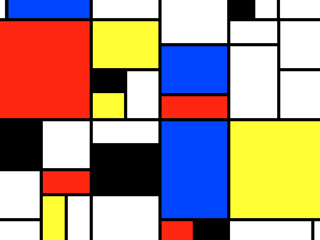
Mondrian - abstraction wipes out representation
Peter Haley - nothing entirely abstract or entirely representational. Eg: radiators, prison cells, blinds


My work alternates, wants to be abstract but can find representations within it. Drifts. Not intentional but people often find it interesting and makes it relateable.
Ryman - white could be snow/cheese
Try out modelling/structure paste. Filler mixed with PVA might flake less
Olitski - uses gel
Thickner/gel. Pigment and binder
Polke - joined pieces, transparent, vanish, dust
Daring, challenging
Try not to repeat or get stuck
Can't just create a new character or use a new photo, have to find a whole new process
Disable, destory, renevate
Gorgeous and horrendous at the same time
Things to disuss with Simon:
Want to exhibit more than one piece - feel they work better together. How
Friday 10th March 2017
Lots of new work, fluidity to it. Brain knows it is all on one plane but appear on different levels
Colour has symbolisms - pink: kitsch, gay, political. Gold and purple
Figurative qualities - brush strokes of obscured bushy trees, thin drips - like detailed eyelashes
John Baldesari


Circles - censorship, cut out, blocks of colour, cartoon like - south park balloon heads
Peter Macdonald


Cartoon/japanese, flat, diagram like
London trip 31st March to see Rauschenberg etc would be good for me
Circle piece resembles planet - I don't like this, like it that my work sparks imagination in others but don't like it when my pieces too obviously resemble figurative things.
One of the complications of painting. Painting is a very narrow convention
If I accept the figurations I can monitor them, if I ignore them/pretend they don't exist I
Cartoony world - Carrol Dunham

Time to see mindblowing stuff. Seen enough process paintings, have established my sense of process. Now about exploring things to really push my work.
Howard Hodgkin
 Idea of frames, painted on the frame/over the frame. Frame is supposed to be the outside of the work, usually not significant or supposed to be looked at. Usually invisible, unnoticed, invisible connection to the work. Sometimes they are totally significant, gold patterned frames to signify importance of the work. Mark Ryden cartoon/fairytale scenes

Hodgkin's work is semi-abstract. Artist envisions a space - gives the work a sense of purpose - different to the way I work


Lucio Fontana


Sacrificial, stabbing, destroying
Minimalism, circle infinity pieces
Used the painting as a material then added the art
Poked holes in both sides - texture
Fresh and kitsch for his time
Beautiful ugly, vulgar
Dots created by bubblewrap - honeycomb, Litchenstein used metal mesh to create dots, Polke similar idea
I have embraced what is new and current and have a new way of thinking
Could show one restrained painting as a contrast against the other more bold works. Acts as a full stop or a mute.
Degree show work:
Want to put in more than one - Simon thinks two or 4+ (3 wouldn't work as becomes more of a series, triptych)
Try taking 6 into the space - jammed in, compliment the boldness of the work Peter Bonde?

Mirror - oil sticks well to glass and perspex, acrylic not so much - can sand down the surface to make the paint stick better, also creates a matte surface opposed to the reflective
Installation ideas:
Mary Weatherford

Installation is about challenging the perimeter, no longer restricted to the outline of a canvas/board
No longer restricted to one level plane, build up towards viewer as well as out the sides of the traditional frame
Jasper Johns

Border-lining on sculptural - frank stella

Less of a finite object, where the space becomes as much the work
No longer contained, expanded into environment
Work straight onto the wall becomes framed by the architecture
Katharina Grosse

Jessica Stockholder

Seems sculptural at first glance, importance of colour and surface hints to characteristics of painting
Expanded painting - sculpture in the expanded field, Rosalind Krauss
Work onto the floor, 3D
Bring frame into it - layering. Frame becomes active
Try wonky frames, parallelograms, slipped, piece broken frames together
Picasso - late cubism, colours, work is starting to come out towards you, idea of layering, choice of colour

Tutorial with Craig
I asked Craig if he could give me some advice on my work for the degree show so he came to see me for a mini tutorial. When it comes to arranging my work Craig liked the order I had presented them in, he suggested I hang the white gloss and the mirror closer together, and the other two pieces further apart. There is a direct relationship between the white gloss, empty space and the mirror surface, meaning they work together particularly well.

Want to exhibit more than one piece - feel they work better together. How
Friday 10th March 2017
Lots of new work, fluidity to it. Brain knows it is all on one plane but appear on different levels
Colour has symbolisms - pink: kitsch, gay, political. Gold and purple
Figurative qualities - brush strokes of obscured bushy trees, thin drips - like detailed eyelashes
John Baldesari
Circles - censorship, cut out, blocks of colour, cartoon like - south park balloon heads
Peter Macdonald


Cartoon/japanese, flat, diagram like
London trip 31st March to see Rauschenberg etc would be good for me
Circle piece resembles planet - I don't like this, like it that my work sparks imagination in others but don't like it when my pieces too obviously resemble figurative things.
One of the complications of painting. Painting is a very narrow convention
If I accept the figurations I can monitor them, if I ignore them/pretend they don't exist I
Cartoony world - Carrol Dunham
Time to see mindblowing stuff. Seen enough process paintings, have established my sense of process. Now about exploring things to really push my work.
Howard Hodgkin
Hodgkin's work is semi-abstract. Artist envisions a space - gives the work a sense of purpose - different to the way I work


Lucio Fontana

Minimalism, circle infinity pieces
Used the painting as a material then added the art
Poked holes in both sides - texture
Fresh and kitsch for his time
Beautiful ugly, vulgar
Dots created by bubblewrap - honeycomb, Litchenstein used metal mesh to create dots, Polke similar idea
I have embraced what is new and current and have a new way of thinking
Could show one restrained painting as a contrast against the other more bold works. Acts as a full stop or a mute.
Degree show work:
Want to put in more than one - Simon thinks two or 4+ (3 wouldn't work as becomes more of a series, triptych)
Try taking 6 into the space - jammed in, compliment the boldness of the work Peter Bonde?

Mirror - oil sticks well to glass and perspex, acrylic not so much - can sand down the surface to make the paint stick better, also creates a matte surface opposed to the reflective
Installation ideas:
Mary Weatherford

Installation is about challenging the perimeter, no longer restricted to the outline of a canvas/board
No longer restricted to one level plane, build up towards viewer as well as out the sides of the traditional frame
Jasper Johns
Border-lining on sculptural - frank stella
Less of a finite object, where the space becomes as much the work
No longer contained, expanded into environment
Work straight onto the wall becomes framed by the architecture
Katharina Grosse
Jessica Stockholder
Seems sculptural at first glance, importance of colour and surface hints to characteristics of painting
Expanded painting - sculpture in the expanded field, Rosalind Krauss
Work onto the floor, 3D
Bring frame into it - layering. Frame becomes active
Try wonky frames, parallelograms, slipped, piece broken frames together
Picasso - late cubism, colours, work is starting to come out towards you, idea of layering, choice of colour

Tutorial with Craig
I asked Craig if he could give me some advice on my work for the degree show so he came to see me for a mini tutorial. When it comes to arranging my work Craig liked the order I had presented them in, he suggested I hang the white gloss and the mirror closer together, and the other two pieces further apart. There is a direct relationship between the white gloss, empty space and the mirror surface, meaning they work together particularly well.

No comments:
Post a Comment